Search Sort by Newest to OldestOldest to NewestRelevanceA-ZZ-A A deep dive into state health scorecards This week’s graphic highlights a new report from The Commonwealth Fund with data on state-by-state health performance. Infographic Medicaid a prominent coverage provider among birthing parents In light of Medicaid cuts in the now-signed OBBB becoming law, this week’s graphic highlights a prominent use of Medicaid. Infographic Healthcare affordability declining This week’s graphic highlights new Gallup survey data and Bureau of Labor Statistics inflation data to consider growing healthcare affordability challenges. Infographic Implications of potential federal policy changes for hospitals In this week’s graphic, we highlight new analysis from our colleagues at Sg2 that illustrates a framework to help providers evaluate the implications of a changing policy landscape. Infographic PSHPs Report Better Preventative Care Outcomes Following last week’s graphic on Medicare Advantage (MA) star ratings, this week we highlight how different types of MA plans perform along certain patient outcomes metrics. Infographic MA Enrollees Continue to Choose Highly Rated Plans With the new year marking the official start of another record-breaking year for Medicare Advantage (MA) enrollment, this week’s graphic takes a look at MA star ratings. Infographic Providers Increasingly Frustrated by Lost Revenues from Medicare Advantage Plans After hearing reports from health systems about decreasing revenue capture from Medicare Advantage (MA) plans, this graphic dives into some of the trends driving this costly challenge providers are facing. Infographic Highlighting LGBTQ+ Healthcare Disparities In honor of Pride Month, the graphic highlights the inequities many members of the LGBTQ+ community report facing when accessing healthcare services. Infographic
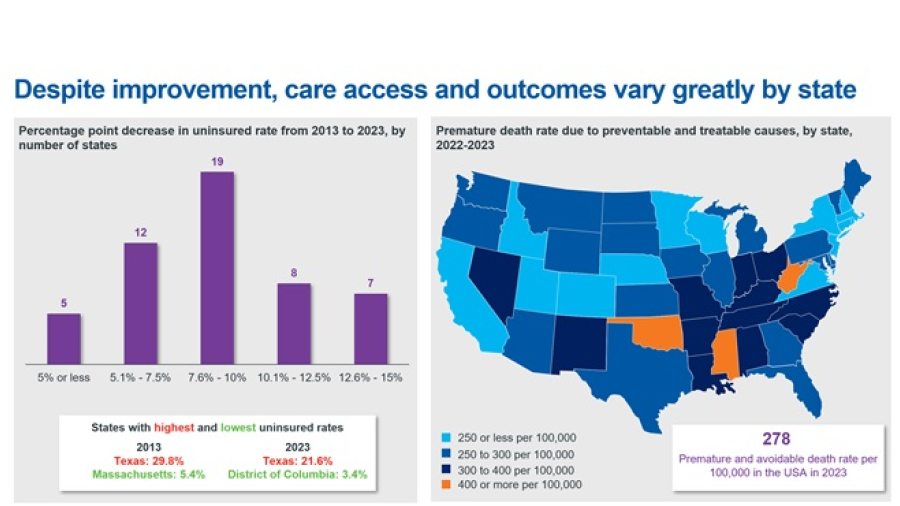
A deep dive into state health scorecards This week’s graphic highlights a new report from The Commonwealth Fund with data on state-by-state health performance. Infographic
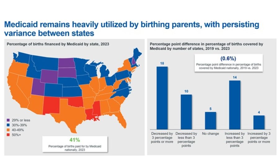
Medicaid a prominent coverage provider among birthing parents In light of Medicaid cuts in the now-signed OBBB becoming law, this week’s graphic highlights a prominent use of Medicaid. Infographic
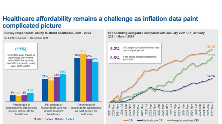
Healthcare affordability declining This week’s graphic highlights new Gallup survey data and Bureau of Labor Statistics inflation data to consider growing healthcare affordability challenges. Infographic
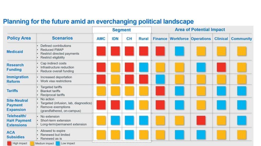
Implications of potential federal policy changes for hospitals In this week’s graphic, we highlight new analysis from our colleagues at Sg2 that illustrates a framework to help providers evaluate the implications of a changing policy landscape. Infographic
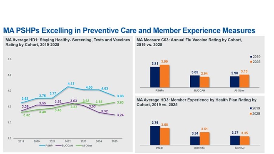
PSHPs Report Better Preventative Care Outcomes Following last week’s graphic on Medicare Advantage (MA) star ratings, this week we highlight how different types of MA plans perform along certain patient outcomes metrics. Infographic
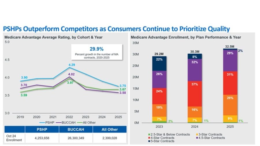
MA Enrollees Continue to Choose Highly Rated Plans With the new year marking the official start of another record-breaking year for Medicare Advantage (MA) enrollment, this week’s graphic takes a look at MA star ratings. Infographic
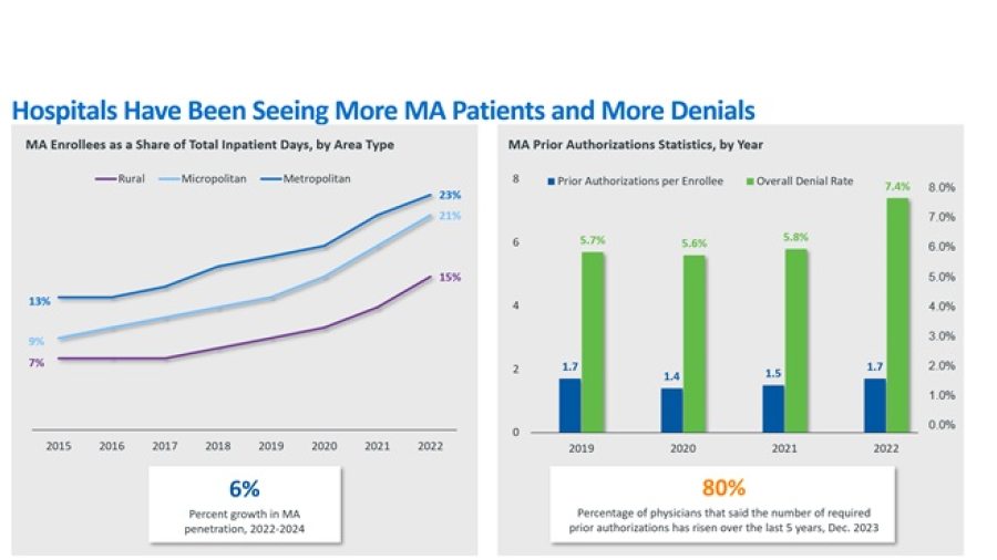
Providers Increasingly Frustrated by Lost Revenues from Medicare Advantage Plans After hearing reports from health systems about decreasing revenue capture from Medicare Advantage (MA) plans, this graphic dives into some of the trends driving this costly challenge providers are facing. Infographic
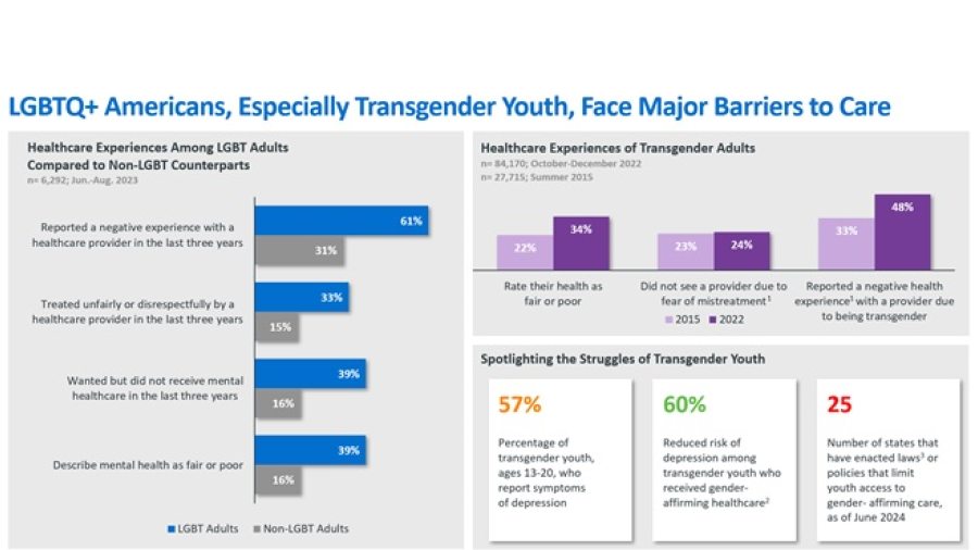
Highlighting LGBTQ+ Healthcare Disparities In honor of Pride Month, the graphic highlights the inequities many members of the LGBTQ+ community report facing when accessing healthcare services. Infographic